First things first: this is post #133 for 2022, which ties my all-time annual record (133 posts in 2013). One more post, and I'll have set an annual record for myself... with five months remaining. I like my odds. However, this also marks all-time post #989, putting me eleven posts away from lifetime post #1,000. I want to do something special for that post once it gets here... I know what post #999 is about (the past, duh), but I'd like post 1,000 to be about the future in some way. I suppose I'll know when I get there...
That said, I'm trying to plan for my future by learning from my past. I am pretty sure I want to work on Army Ants comics and game support (duh again), but what the looks like is still a debatable topic. I'm going to focus on the dilemma about comics for now... I'll get to the RPG stuff soon enough.
In terms of design, I go back and forth between planning full pages and half pages. There is a fundamental difference in how I visually design when I'm working in one or the other. With the full page, I tend to think more vertically, while with the half page I tend to think more horizontally. Full pages are more traditional, but half pages have their own traditions; these are more akin to classic comic strips, and also to the way that Carl Barks and his ilk have worked - they publish full pages, but work in half-page increments.
I also like half pages for reading on screens; I know that most people are reading on a phone now, so it doesn't matter, but I still spend a lot of time on my Surface Pro, and horizontal alignment is the default for me. Also, we read from left to right, not top to bottom, which suggests to me that there is an inherent benefit to approaching things that way.
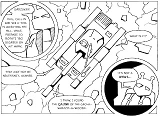
Most importantly, the evidence I've got is that I've done my best work in half-page increments. My favorite Ants stories used that approach. In some instances, even when I was drawing full pages, I was thinking of the page as a top and bottom with a break across the middle of the page. I run into layout problems sometimes when I have a full page to work with; I end up with moments where it's not clear what 'direction' to move in visually as you cross the page. The half page design puts up some guard rails from my own weaknesses as a page designer. Here's a revised image from my remastering of Slab Smash that shows what I mean... I love this particular layout.
This means that the two pages I've done for New Frontier will have to be re-configured, but that's no great shakes.

No comments:
Post a Comment