
I went back and took the top half of my previous page one, re-formatted it into the new half-page orientation, and played with some layout and font options. Here are variations one through four...


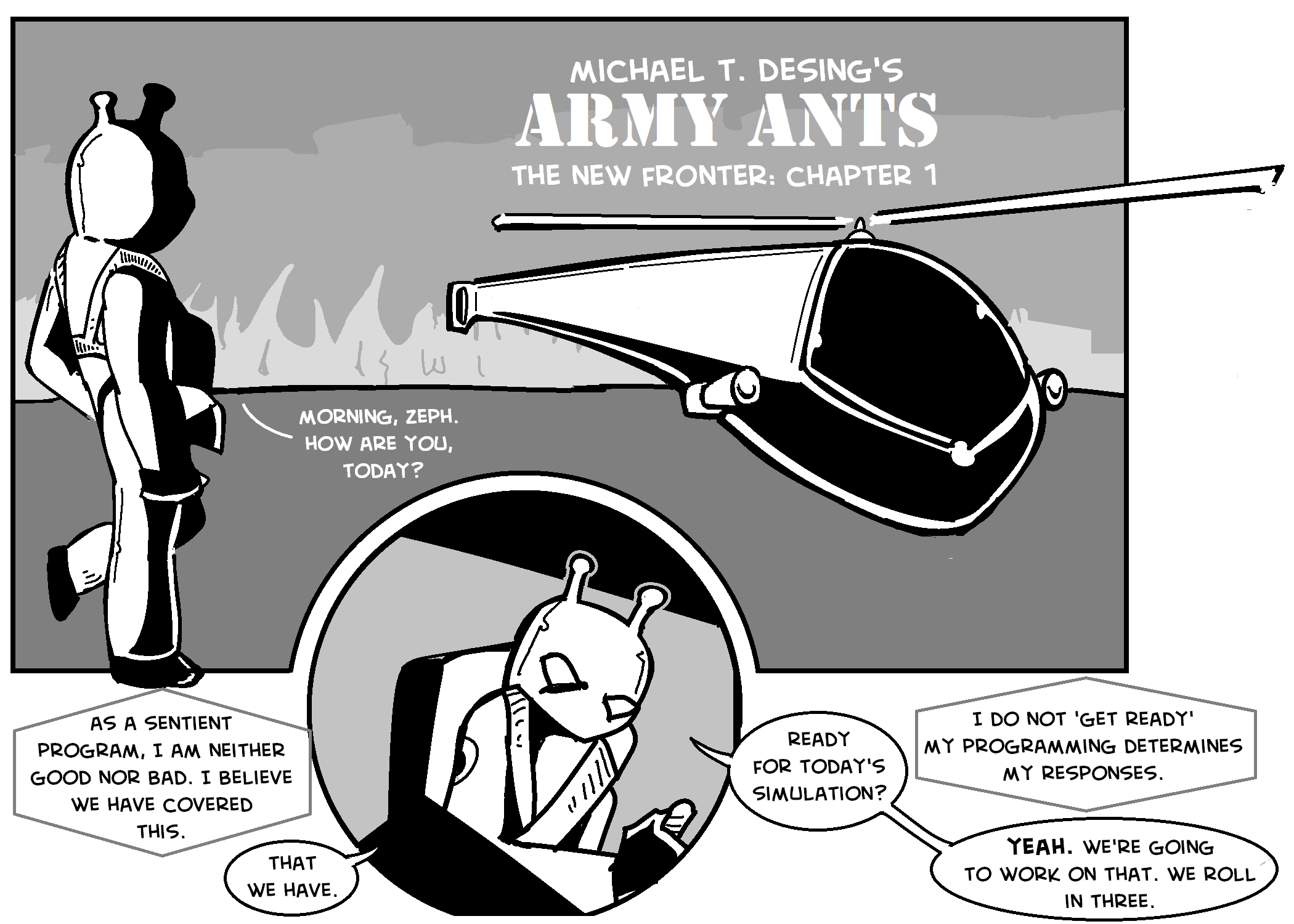
In variation one, I just moved the existing elements around; I changed the frame on the second image from a square to a circle for variety's sake.
In variation two, I mirrored the image and moved the dialogue around. I think that this is overall better; I like the second panel being to the right, but then the dialogue gets clunky. It is more important that you know how to 'read' the page. Option one is not quite as clear about what order to read the balloons (do you start at the far left, or at the top? the answer is at the top, and then reset to the lower left corner; but it could cause confusion); option two makes it quite clear, going left to right and top to bottom.
In variation three, I swapped out the Anime Ace font for the Creative Block font. Anime Ace is cleaner; Creative Block is closer to my original lettering, and is the one I've been using for the 50+ pages of remastered pages I've done.
In variation four, I went back to the original layout, but moved the circle panel to the middle, widened the first panel, started the dialogue in the first panel, and then allowed the remaining dialogue to flow left to right. I think I like Creative Block better (it's 14 point here), and this is probably the strongest layout of the four...
No comments:
Post a Comment